Project Overview
Background
At Salem Five I wear several hats as their Front-End Developer, UX Designer and UI Designer (and on occasion, photographer). I am responsible for designing and implementing visual and interactive elements that users engage with on Salem Five's website and other applications such as Account Opening, Online Banking and the mobile app. I help support the goals of the eCommerce team of improving the overall user experience across all applications, website optimizations, website accessibility and troubleshooting issues. I work closely with our Applications Developer on the Information Systems team who helps support the back-end development for our projects and our website CMS.
Project Date
Fall 2019My Role
- UX Design
- UI Design
- Front-End Development
The Problem
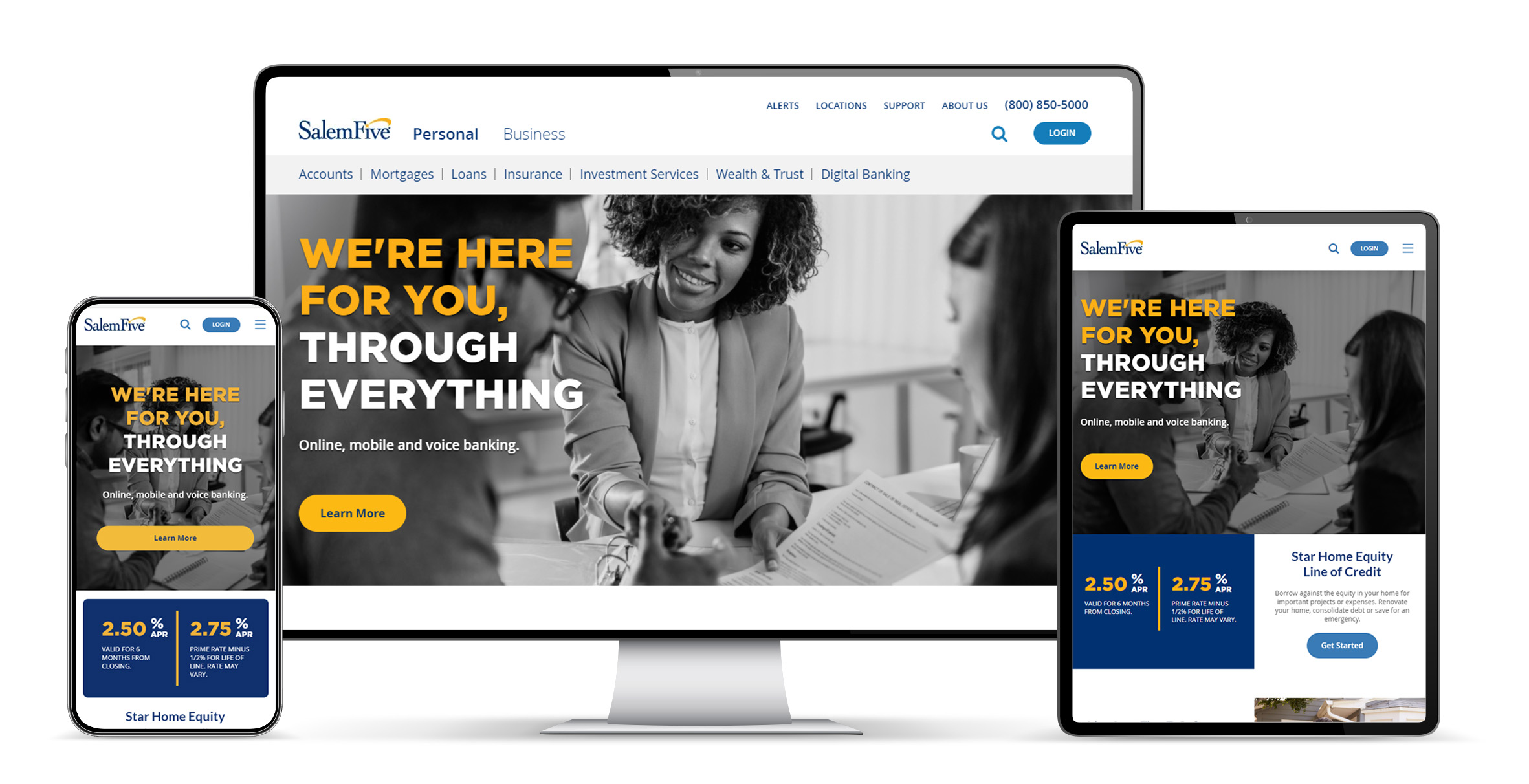
In 2017, Salem Five was approaching the finish line for a major brand and design overhaul, as well as switching financial service providers. The old site worked for its time and was actually emulated by other companies in the same field, but it was starting to show its age by not being responsive or keeping up with latest trends and technology. They needed a fresh update that was more modern, reliable, and sophisticated.
They had been working with an outside design agency for over a year to design and build a brand new website for them. The result, while better in every way from what they previously had, was not quite what the Marketing and eCommerce teams were really hoping for. Many elements were not responsive or appeared rather sloppy on mobile, the accessibility score was far lower than they had hoped, the redesign presented navigational and usability issues, and the path to opening an account was more complicated than necessary.
Research
To start, we dove into a lot of the past and recent feedback we receive from customers via our call center and help desk to get a better understanding of user needs. I also worked closely with a company we partner with that focuses specifically on UX research to help identify potential areas for improvement, as well as keep consistent with the expected experience within our industry. We created a few different journeys for different demographics and illustrated how they might interact with our applications through the process of opening a new account.
Based on user research and feedback received, we had a good idea where we needed to make improvements. But some things weren't easy changes to completely start from scratch on with the newly designed system, and other feedback marked as "issues" were not deemed problematic by certain stakeholders, regardless of the data. So after identifying the areas we could make meaningful improvements to, we got to planning the path forward.
Design & Prototyping
We broke the issues into 2 categories: Items specifically affecting the path toward opening a new account, and items that did this but were also more global to the site and affected other areas (header, navigation, etc.) At this point, we began wireframing, prototyping, testing and iterating on all our ideas to see what worked best. Here are some specific examples of how we evolved certain items.
Navigation
Prior to the redesign, the navigation was overwhelming to users and did not do a clear job at cutting a path to where the user wanted to go. When the redesign occurred, it went too far in the opposite direction. The bulk of the main navigation was hidden and a user had to identify what type of user they were before they could proceed. On top of this, the navigation was clunky in such that if a user moved the cursor even slightly outside the path of the horizontal menu onto something else, the nav would close and the user would then have to start over. This change frustrated a lot of users and was identified as a major contributor to the increase in bounce rates.
On top of the main nav, some pages had a secondary navigation that started further down the page and locked to the top once a user came to it. While this is not a bad idea in practice, not only did these not even look like navigation items they also weren't accessible until a user scrolled a good way down a page.
Solution
Since an overwhelmingly large number of users coming to the site as identified via analytics were "personal" users, there was no reason to hide the nav by default. We restructured the navigation to be more concise and limit the number of avenues a user can dig down initially, helping guide a user to the right area. The appearance was also reworked to be clearer and help better identify where a user was as well as have a visually cleaner navigation. Also, pages that contained secondary navigation now had this attached to the main navigation and was styled to appear more as a nav.
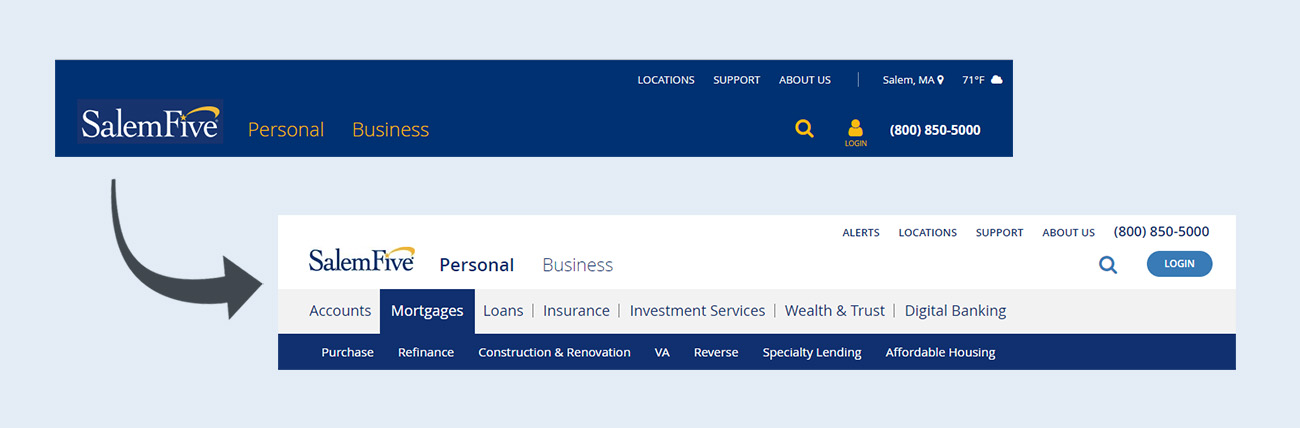
The evolution of the header and navigation
Account Opening
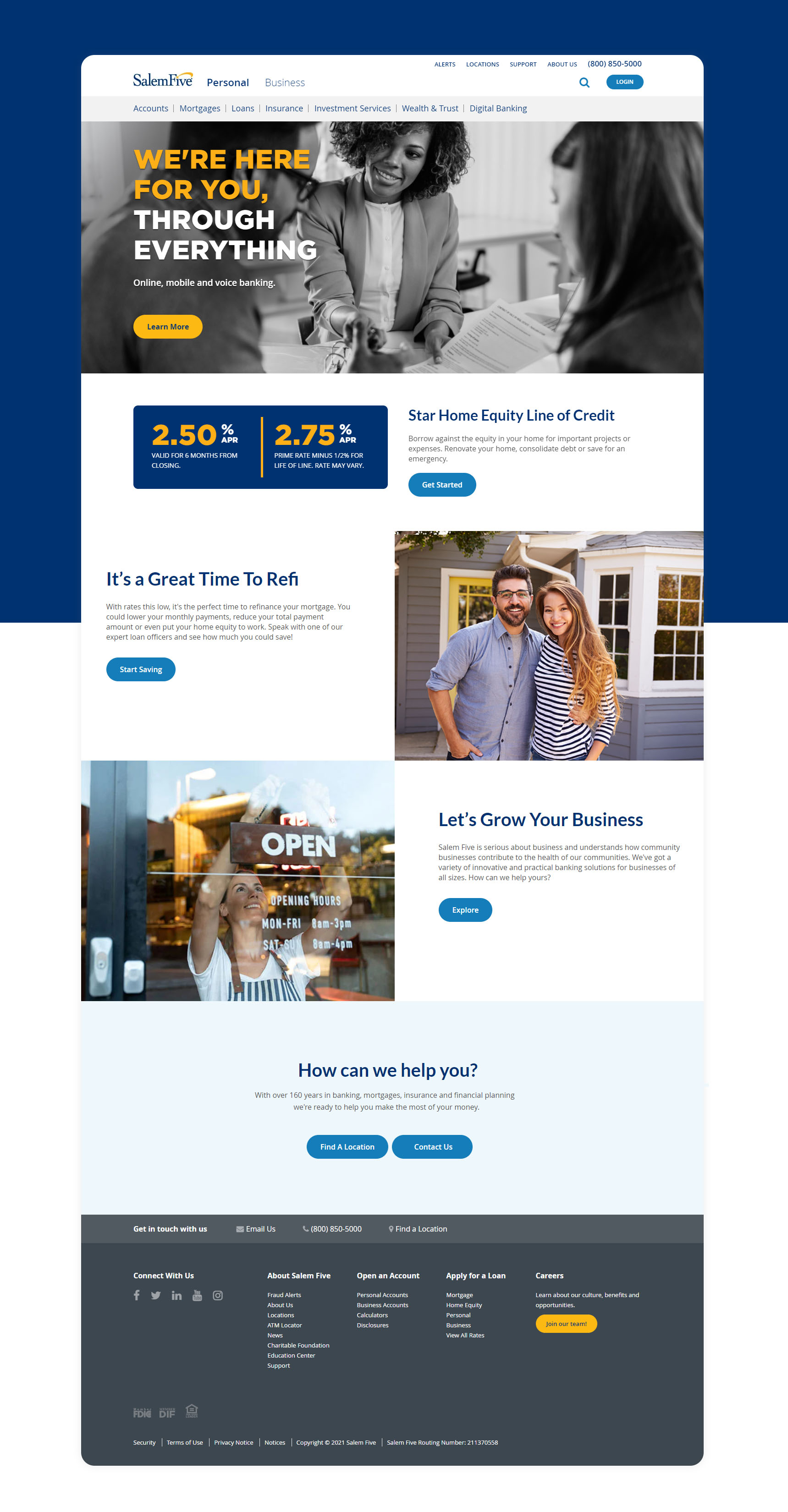
To specifically address the issue of increasing the number of applications, we wanted to make it as easy as possible to guide the user to begin this process in our Instant Open app. This step led us to rethink the landing page which was redesigned to be "simple". Below the minimalist navigation there was a full screen cinemagraph which while visually appealing was nothing more than eye candy and offered no value to a user. We transformed this area into a more actionable hero banner that served not only to drive traffic to account opening, but could also be reused in different campaigns in the future for driving traffic.
Along with the homepage modifications we also carved a clearer path within the sitemap. The redesign sent a user in several different directions depending on what kind of account they might want to open. To simplify this, a new product page was created for the "Open Account" and directly linked to from the homepage. A user could still go elsewhere to learn about other accounts, but this was no longer the default behavior as it was not typical for most visitors. From the product page most questions could be properly addressed before being sent to start the process within Instant Open (discussed in greater detail within in a separate project).
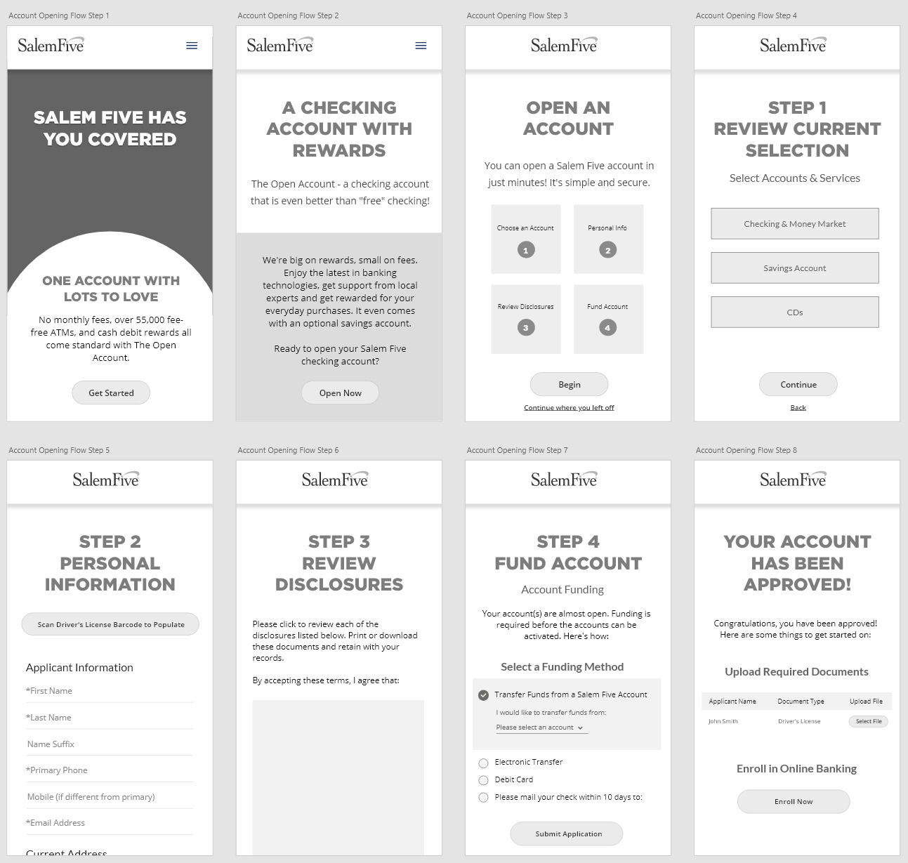
Some wireframes for the account opening flow
Accessibility
As a financial institution, it is important that Salem Five is ADA compliant at the AA level so all consumers can perceive, understand, navigate, and interact with the services offered. When the initial redesign occurred they told me they paid extra to have their website fully accessible, but upon some quick investigation I could tell that they did not get their money's worth. The contrast ratios were not within requirements for AA compliancy, the site was not easily usable for anyone with disabilities, and anyone with a slow internet connection would experience very slow loading times.
Solution
Tackling this was no simple task. The easiest way to build a fully accessible website is definitely to do it while it is being developed, going in after the fact can be a very time consuming process, especially for larger sites. The solution was a combination of identifying which elements contained issues and correcting the markup in their respective modules with the views of our development environment. To help with this effort I used a tool called SiteImprove which crawls a website, identifies problems and illustrates how impactful correcting these issues will be. I still use this tool today along with Google's Lighthouse plugin to help monitor how the website is performing on a regular basis and how any deployments and/or content changes affect accessibility and performance.
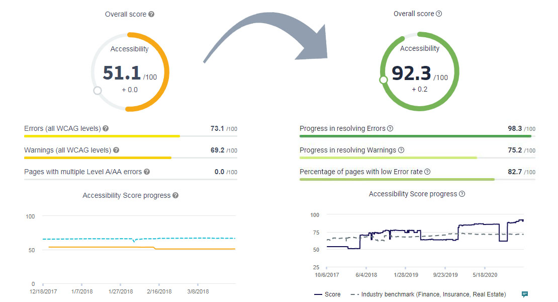
Our accessibility improvements over time
Outcomes
The changes we've made since the old redesign went live have been regarded highly positive both internally and by customers. Some successes include:
- The bounce rate of pages (not going places like Online Banking Login, Instant Open, etc) has gone down from a monthly average in 2017 of 70% to 38% in 2021.
- Our accessibility score for AA compliance has gone up over 40 points from below 51 to 92.
I continue to improve on the impact we have made to the website and applications, and I am constantly working on ways to help evolve the visions stakeholders have into a positive and informative experience for our customers.